Reviving an icon

Choice Magazine has been helping librarians choose materials worth acquiring for more than 50 years. With the rise of digital publishing and internet everywhere, Choice was bleeding subscribers and at risk of sliding into insignificance. How to make themselves relevant to a new generation?

logo

Knowledge is power. Choice's new visual identity is a look at how librarians can help identify the best sources, with sure knowledge of what is worthwhile and what is not.

Libraries are dead. Long live libraries.

As information sources expand exponentially, the need for trusted reviews becomes greater. The new Choice website gives information professionals access to curated content across digital and print media, with a user-friendly interface that supports librarians' mission to help those swimming in a sea of content.

The new brand message and design quickly gained traction. Subscriptions, which had been falling by 20% annually for several years, suddenly turned around, and have more than doubled in less than 12 months.

The brand refresh includes redesign of the cornerstone Choice Magazine. Directors of acquisitions, accustomed to the moribund look of the aging icon, took a fresh look at what Choice can do for them now.

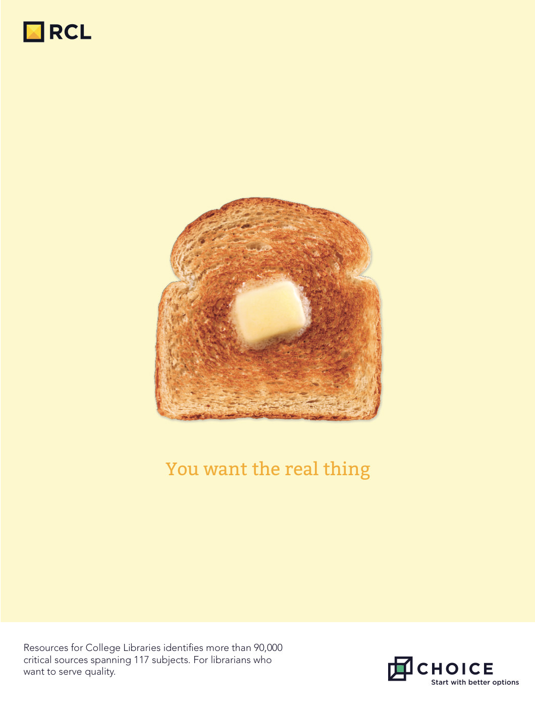
Bringing the new brand identity into every medium — digital, print, events, collateral — reinforces among prospects and subscribers the message that Choice is a relevant, current, and necessary guide to the best sources now.

In less than 12 months, page views are up +350%, sessions are up +300%, and Choice has grown active users by +250%.

Next up: Half Half Half Half Half Marathon